Stitched and woven
Weaving
Weaving builds your design out of coloured yarn on a loom — the artwork is not printed onto the textile, it IS the textile, visible and correct on both faces. A small set of base yarns is interlaced in varying proportions to produce roughly two hundred blended colours, and every shade in your file is matched to the nearest one of those rather than reproduced exactly. It gives blankets and tapestries an heirloom weight and texture no print can imitate, in exchange for bold, high-contrast artwork instead of photographic subtlety.
- Colour range
- ~195 blended coloursSix base yarns, interlaced in varying proportions
- Colours per design
- Up to 8 distinctNear-neighbour shades collapse onto the same blend
- Colour matching
- Nearest achievable blendExact hex matching is not possible
- Photographs
- Not recommended
- Gradients
- Render as stepsNot as smooth fades
- File formats
- PNG, SVG
- Transparency
- Becomes the product colour
Colour comes from blending yarn
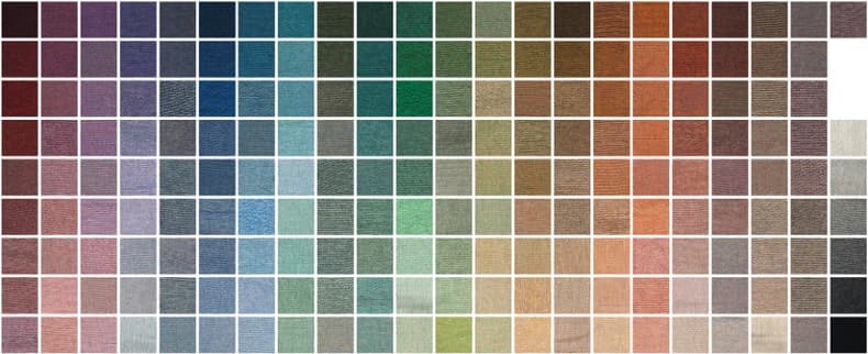
A loom does not mix ink. It interlaces six base yarn colours — red, blue, green, gold, white and black — in different proportions, and the eye blends them at normal viewing distance into around 195 perceived shades. That is a real palette, but a discontinuous one: every colour in your file snaps to the closest combination the loom can actually make.
The range below is the whole of it, photographed as real woven swatches. Two things are worth noticing before you design. It is broad but distinctly earthy — there is no fluorescent anything, and no pure primary. And it is dense through the muted middle, which is where near-neighbour colours in your artwork will collapse onto the same blend and stop being distinguishable from one another.
What happens to a saturated colour
Because matching is to the nearest available blend, the further a colour sits from that range the further it has to travel — and the more it changes on the way.
Fluorescent and neon shades move the most, because nothing in yarn comes close to them: bright yellows and greens are pulled toward gold and olive, and light or pastel tones generally read duller and earthier woven than they do on screen. Colours already in the muted part of the spectrum barely move at all, which is why designs built from that palette come back looking almost exactly as intended.
The practical consequence is that a design should be judged against the range, not against your monitor. If a colour is doing important work in your artwork, check whether anything near it exists in yarn before you commit.
Gradients become steps
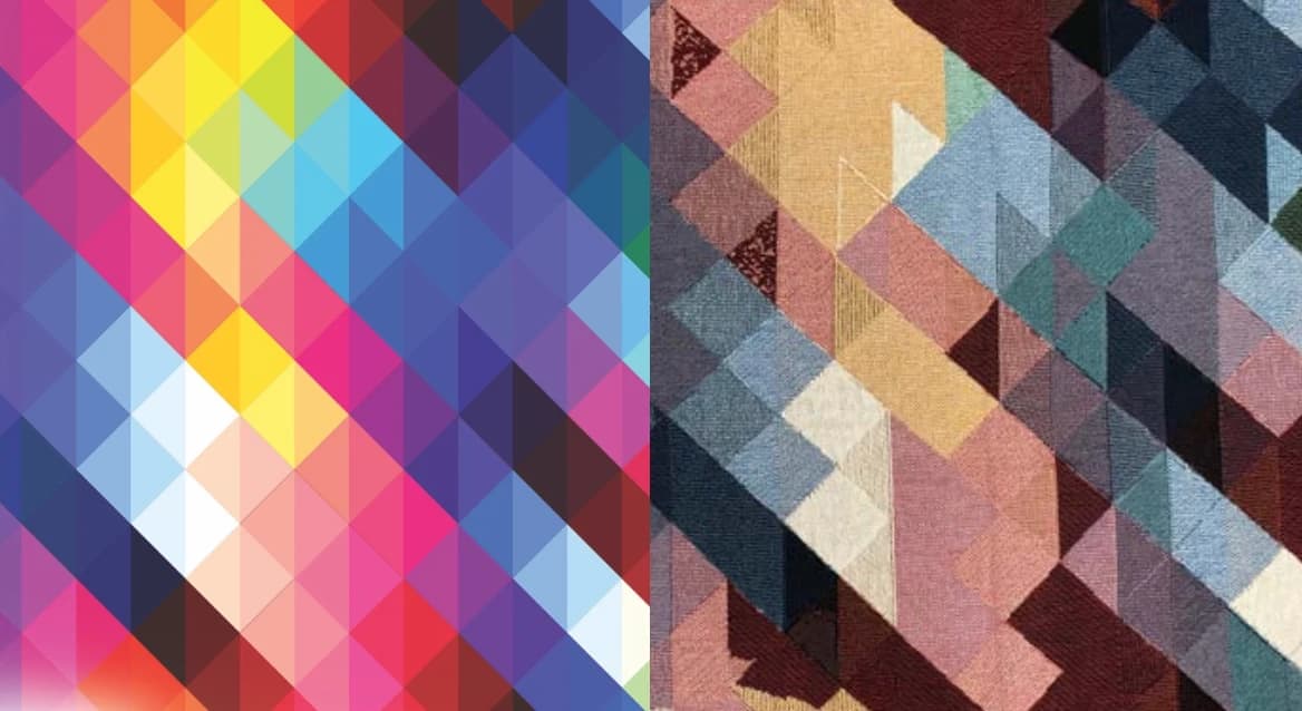
There is no way for a loom to fade continuously. A gradient is rendered as a series of discrete bands, each one a different yarn blend, with a visible edge between them.
That is not a failure to design around so much as a property to design with. Gradients built from a few strong, deliberate steps look intentional and handsome. Gradients built as smooth 256-step fades look like banding, because that is exactly what they become.
Choosing the right finish
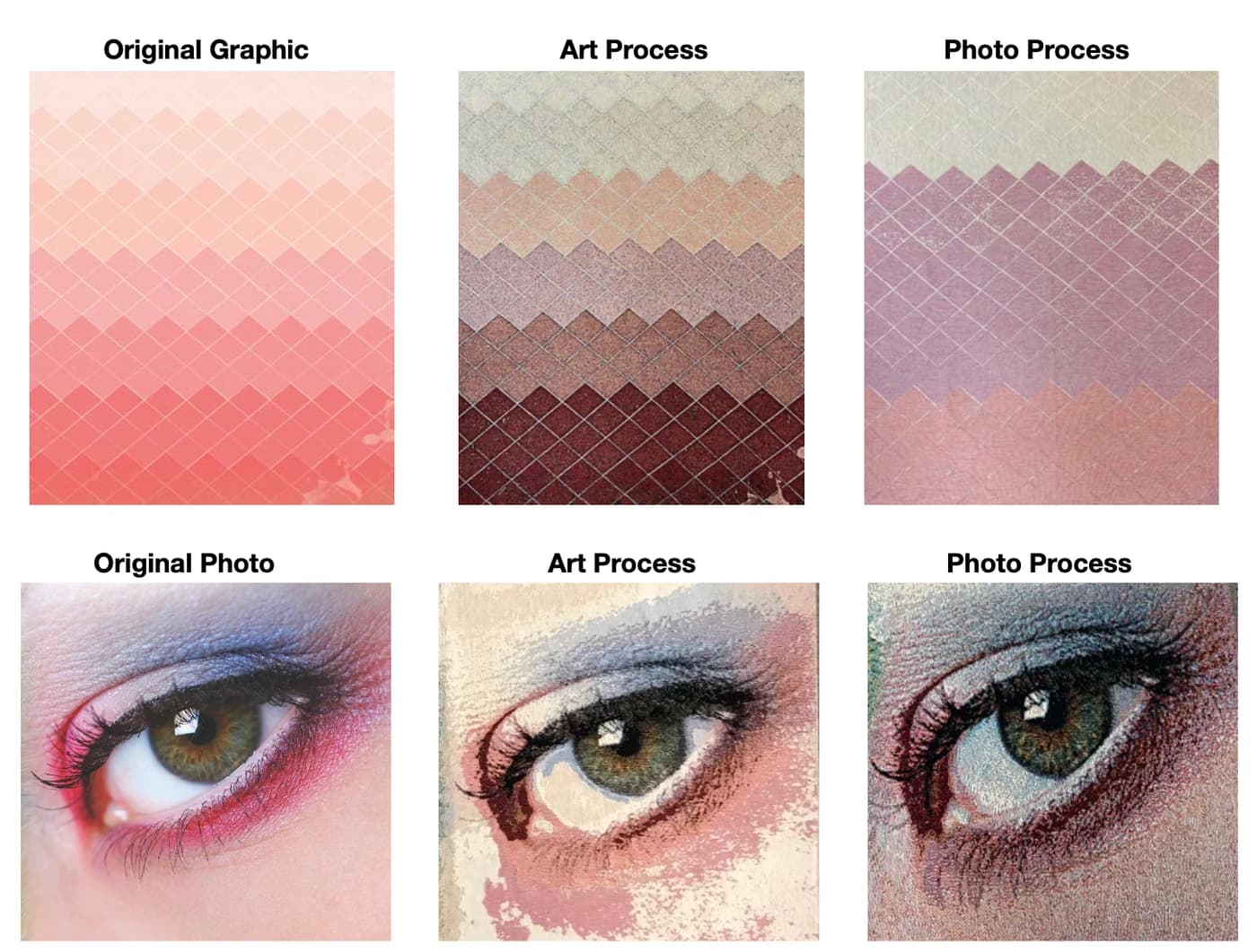
Woven products are made in one of two finishes, and picking the wrong one is the most common cause of a disappointing result.
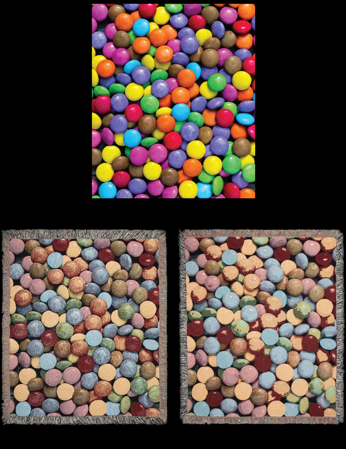
The photo finish is tuned for photographs and photorealistic imagery — it carries subtle tonal gradation and fine detail well. Used on bold graphic artwork it makes the colours look muddled and washed out.
The artwork finish is tuned for graphic designs with solid, separated colour blocks — it keeps them sharp and clean. Used on a photograph it produces patchy areas and visible banding between tones.
Saturation and brightness matter most under the artwork finish. A colour that is very light or very saturated has the fewest neighbours in the range, so it is the one most likely to come back as something you did not expect.
What weaves well
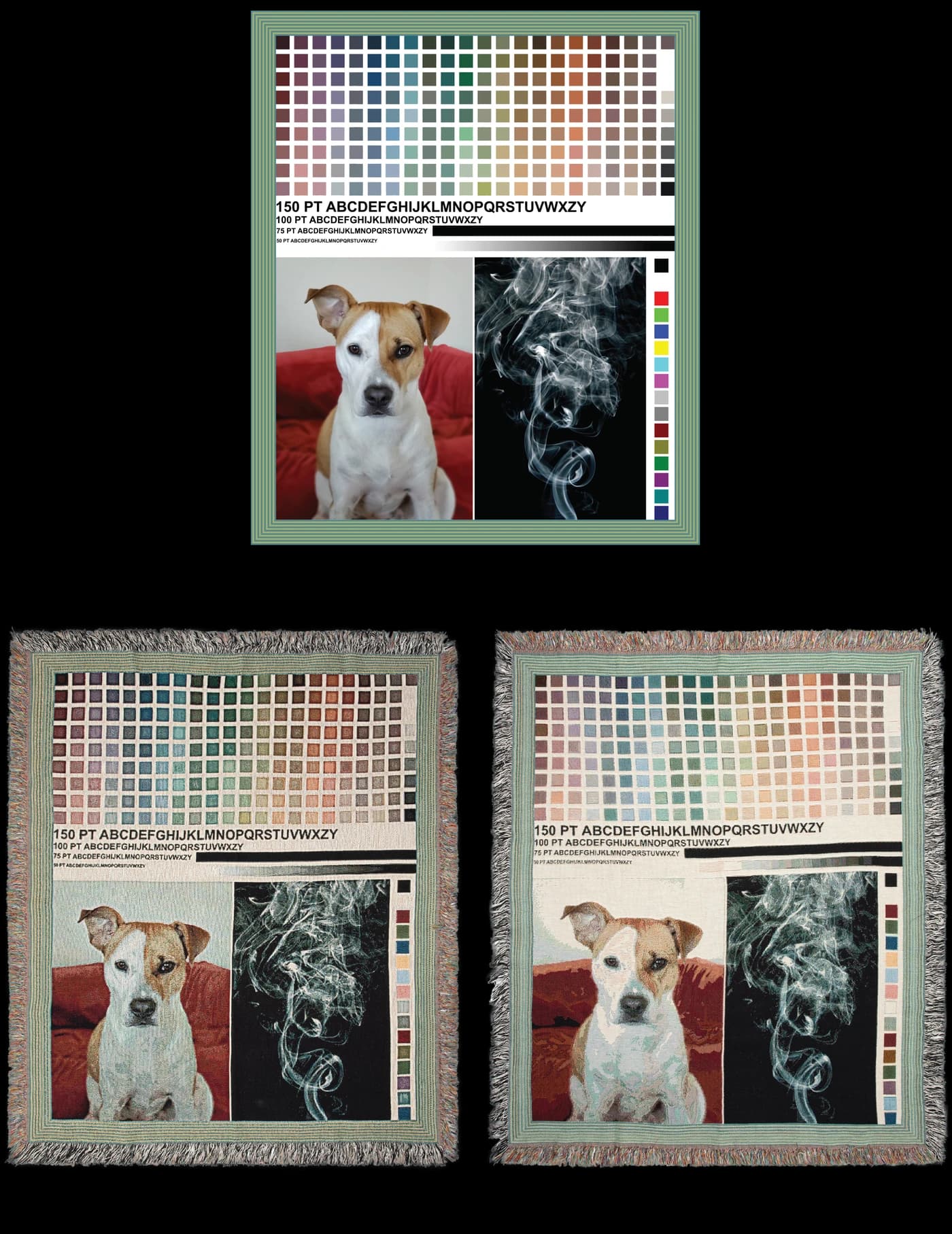
Bold shapes, strong outlines and clear separations between colours. Large, heavy type. Busy, textured compositions where no single fine detail carries the whole design.
Two things to avoid. Fine intricate detail simply is not reproducible at the scale a yarn occupies. And large flat areas of a single colour are surprisingly difficult — they show every small irregularity in the weave, which is why a pattern with visual activity across it looks better than an expanse of flat colour.
Transparent areas in your file are not woven as anything; they come through as the product’s own base colour, which makes transparency a usable design element rather than a problem.
Do this, not that
Do
- Pick colours from the achievable rangeAnything outside it is matched to the nearest blend, and you do not choose which.
- Use bold shapes with high-contrast transitionsContrast survives the yarn blend; subtlety collapses into the nearest match.
- Limit the design to 8 or fewer clearly distinct coloursNear-neighbour colours snap onto the same blend and stop being distinguishable.
- Pick the finish that matches the artwork — photo or graphicThe wrong finish muddles a graphic or bands a photograph.
- Set any text large and heavyA woven letterform is built from yarn crossings and needs room to stay legible.
Avoid
- Neon, fluorescent and very bright yellowsNothing in yarn comes close, so they shift furthest — usually toward gold or olive.
- Smooth gradients and soft fadesThe loom renders them as visible steps; a few deliberate steps look far better.
- Small intricate detailsDetail finer than the weave itself cannot be reproduced.
- Large flat areas of a single colourThey expose every small irregularity in the weave; visual texture hides it.
Common questions
- Why do woven colours look different from my design file?
- A loom produces colour by interlacing six base yarns rather than by mixing ink, giving around 195 achievable blends, so every shade in your file is matched to the nearest of those. Exact hex matching is not possible. Neon and fluorescent shades shift the most because nothing in yarn comes close to them — bright yellows and greens typically land in gold or olive.
- What colours can a woven blanket actually produce?
- Around 195 blended colours, made by interlacing red, blue, green, gold, white and black yarns in varying proportions. The range is broad but distinctly earthy: it contains no fluorescents and no pure primaries, and it is densest through the muted middle tones. Designs built from that part of the spectrum reproduce almost exactly as intended.
- Can woven blankets reproduce gradients?
- Only as steps. Each band of a gradient is a different yarn blend with a visible edge between bands, so a smooth 256-step fade arrives as banding. Design the gradient as a handful of strong, deliberate steps and it will look intentional rather than like an artefact.
- Should I choose the photo or artwork finish?
- Photo finish for photographs and photorealistic images — it carries subtle tonal gradation. Artwork finish for graphic designs with solid, separated colour blocks — it keeps them sharp. Using the photo finish on bold graphics makes colours look muddled; using the artwork finish on a photograph produces patchy areas and banding.
- What happens to transparent areas in a woven design?
- They come through as the product’s own base colour. Nothing is woven there, so transparency works as a usable design element — you can let the blanket’s own colour form part of the composition.
- Can you weave a photograph?
- It is possible with the photo finish, but it is the hardest case. A photograph depends on continuous tonal detail, and weaving reproduces a limited set of blended colours in discrete steps. A photograph simplified into bold shapes with strong contrast weaves far better than the original ever will.
Products made this way
Related methods
How we know this
- Supplier woven-product design guidelines and reference photography — verified 2026-08-15
- BelDisegno production capability record — verified 2026-08-15