Dyed into the material
All-over print (cut & sew)
All-over printing prints the fabric first and builds the garment afterwards, so the design covers the entire item — sleeves, sides, seams and all — with no edge where the print stops. Repeating patterns are what the method is built for, because artwork has to fill the whole template rather than sit in a box. The two things to design around are placement, which shifts by up to 75 px on a 150 DPI template because the pieces are cut and sewn by hand, and colour, which prints onto white fabric and so lands slightly lighter than it looks on screen.
- Coverage
- Entire garmentAcross seams and panels
- Placement tolerance
- ±75 px on a 150 DPI templateInherent to cut & sew
- Material
- Polyester and syntheticsDye needs a synthetic to bond to
- Resolution
- 120–150 DPIFor large items; 300 DPI for small
- Best artwork
- Repeating patterns
- Colour mode
- RGB
Safe area, print area and bleed
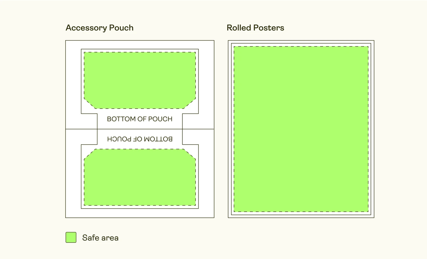
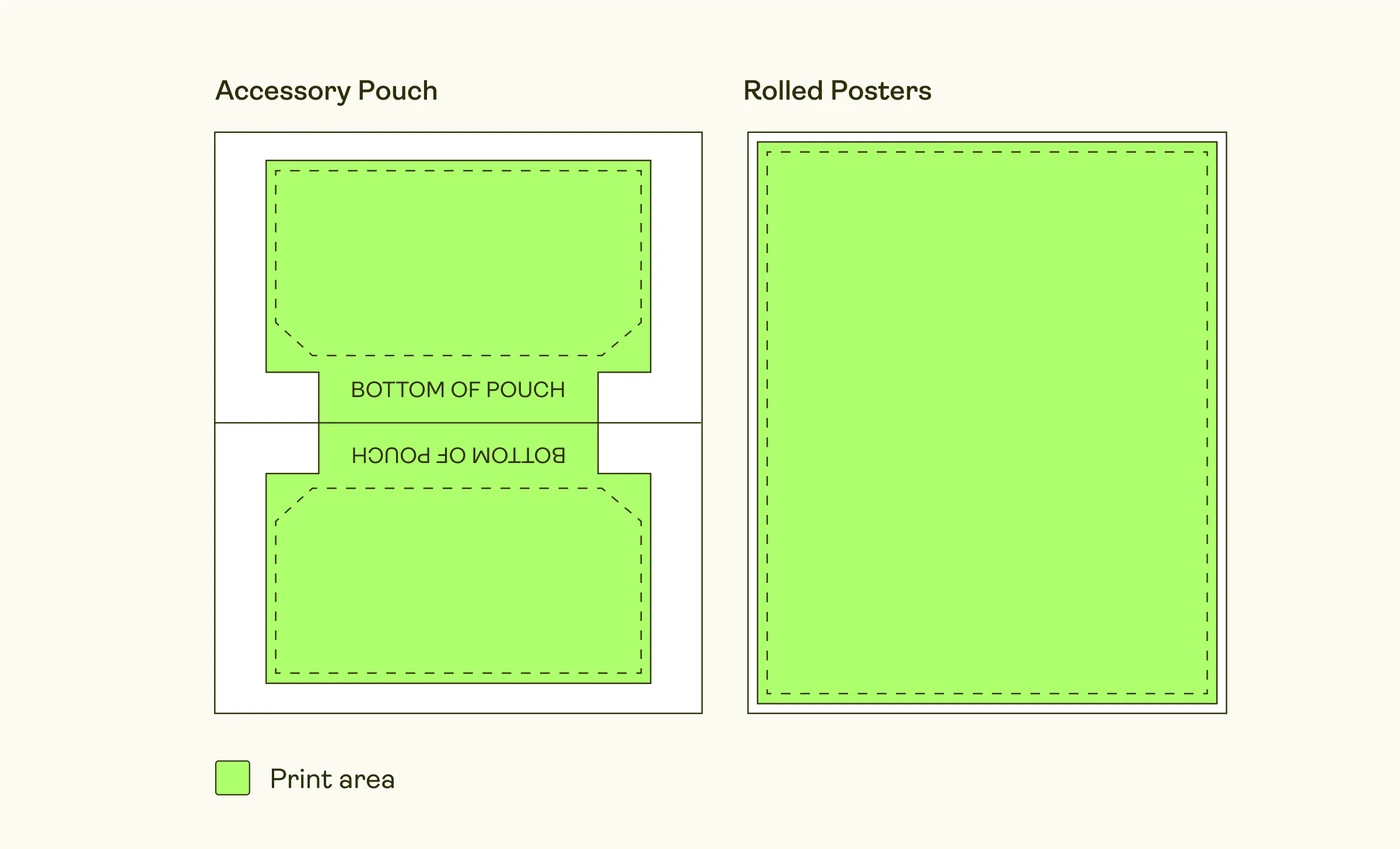
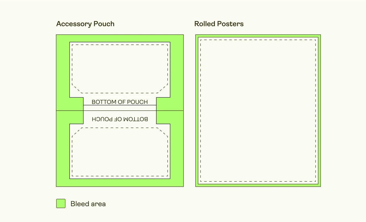
Every all-over template shows three regions and they mean different things. The print area is everything that receives ink. The bleed is the outer margin beyond it — mostly consumed by seams and hems, so it is rarely visible on the finished item, but artwork must still cover it or you will get an unprinted white edge where the fabric was cut a fraction wide. The safe area is the inner region marked by a dashed line, and it is the only part you can count on being both printed and visible.
The working rule is simple: cover one hundred per cent of the template with artwork, and keep anything you would miss inside the safe area. A repeating pattern satisfies both at once, which is exactly why patterns are the natural fit for this method.
Print areas differ slightly from size to size, so if a design depends on precise positioning it is worth adjusting the file per size variant rather than uploading one placement everywhere.
Placement drifts, and that is normal
The fabric is printed flat, then cut into panels and sewn together by hand. Every one of those steps has a tolerance, and they accumulate: on the finished garment a given element can sit up to about 75 px on a 150 DPI template from where the mockup showed it. This is inherent to cut and sew rather than a fault, and it is why the method is unsuited to any design that depends on exact positioning.
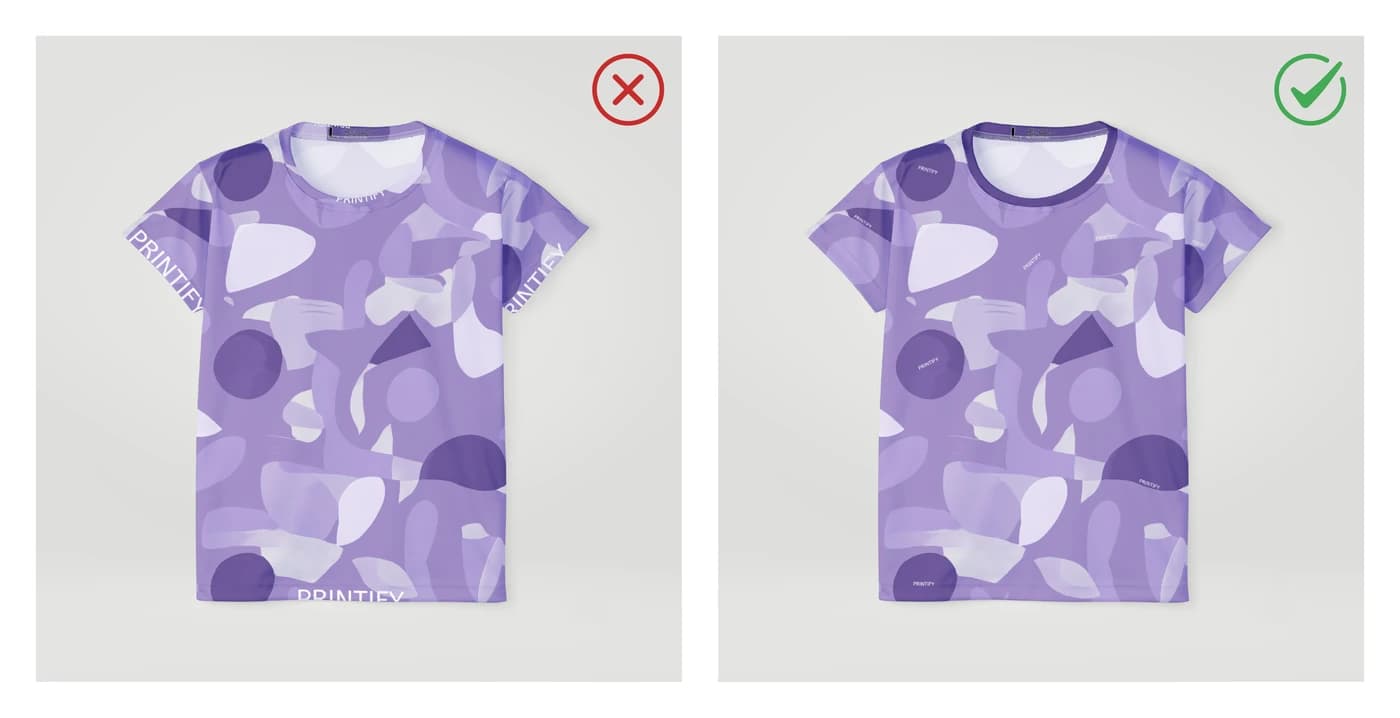
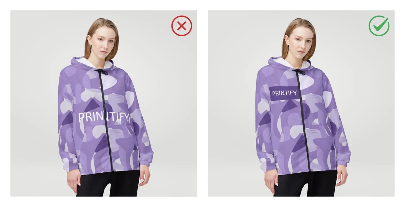
Three consequences follow. Do not place important elements at the collar or cuffs, where they may be trimmed away entirely. Do not run text or a key element across a seam or a zip and expect the two halves to align. And avoid designs whose whole point is being perfectly centred — an off-centre monogram reads as a mistake even when it is within tolerance.
Because the panels are joined by hand, faint pattern markings used to guide the sewing are sometimes visible on the inside of a garment. They are part of how the item is made and do not show from the outside.
Colour on white fabric
These garments start white and your colours are printed onto them. Ink does not fully block the fabric underneath, so the white shows through a little and every colour lands slightly lighter and less dense than it appears on screen. The effect is most obvious with black: a pitch-black background typically prints as a deep charcoal grey.
Design with that in mind rather than fighting it. Mid and rich tones reproduce beautifully and stay vivid for the life of the garment. If a design truly needs solid black, it is better suited to a surface method that prints onto black fabric to begin with.
One related effect: when a stretchy item like leggings is worn, the fabric opens slightly at the stress points and fine white lines can appear between the elements of a dark pattern. Busier patterns and lighter grounds hide this; large dark flats show it most.
Do this, not that
Do
- Cover 100% of the template, bleed includedAny uncovered area becomes a white edge once the panel is cut.
- Use a repeating patternIt fills the whole template naturally and is immune to placement drift.
- Keep anything important inside the safe areaThat is the only region guaranteed to be both printed and visible.
- Supply large items at 120–150 DPI or betterA blanket or tapestry template is enormous; that is real resolution at that physical size.
Avoid
- Placing key elements at collars, cuffs or hemsThose areas are trimmed and sewn, and the element may be cut away.
- Running text or a focal element across a seam or zipThe two halves cannot be aligned reliably by hand.
- Designs that must be perfectly centredPlacement shifts up to 75 px on a 150 DPI template, and an off-centre focal point reads as a defect.
- Large areas of pitch blackPrinted onto white fabric, saturated black lands as charcoal and shows white lines when stretched.
Common questions
- What are safe area, print area and bleed?
- The print area is everything that receives ink. The bleed is the outer margin beyond it, mostly taken up by seams and hems — artwork must cover it or a white edge appears where the fabric is cut. The safe area is the inner region marked by a dashed line and is the only part guaranteed to be both printed and visible, so all text and key elements belong inside it.
- Why is my all-over design not exactly where the mockup showed it?
- All-over garments are printed flat, then cut into panels and sewn by hand, and each step has a small tolerance that adds up. An element can sit up to about 75 px on a 150 DPI template from its mockup position. This is inherent to cut-and-sew production rather than a defect, which is why designs that depend on exact centring are not suited to the method.
- Why did my black all-over print come out grey?
- The garment is white and your colours are printed onto it. The ink does not completely block the fabric beneath, so some white shows through and every colour lands slightly lighter — most visibly with black, which typically reads as deep charcoal. For a true solid black, choose a method that prints onto an already-black garment.
- What resolution do all-over print files need?
- 120–150 DPI is sufficient for large items such as blankets, leggings and tapestries, because the templates are physically enormous and a 300 DPI file at that size would be unmanageable. For smaller items, 300 DPI remains the target. In both cases the number that matters is the resolution at the final printed size.
- What artwork works best for all-over printing?
- Repeating patterns. They fill the entire template without leaving gaps, they look correct regardless of where the panels are cut, and they are unaffected by a placement tolerance of 75 px on a 150 DPI template. Single large focal images are the hardest case, because both the cut position and the seams work against them.
Products made this way
Custom Bed Sheets, Twin Fitted Bedding with Your Design
Custom Women's All-Over Print Skater Skirt with Your Photo or Design
Custom Men's All-Over Print Hawaiian Shirt with Your Photo or Design
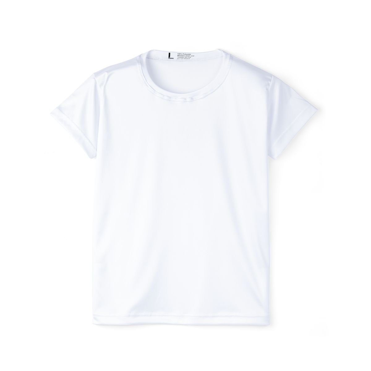
Custom Women's All-Over Print Team Jersey with Your Photo or Design
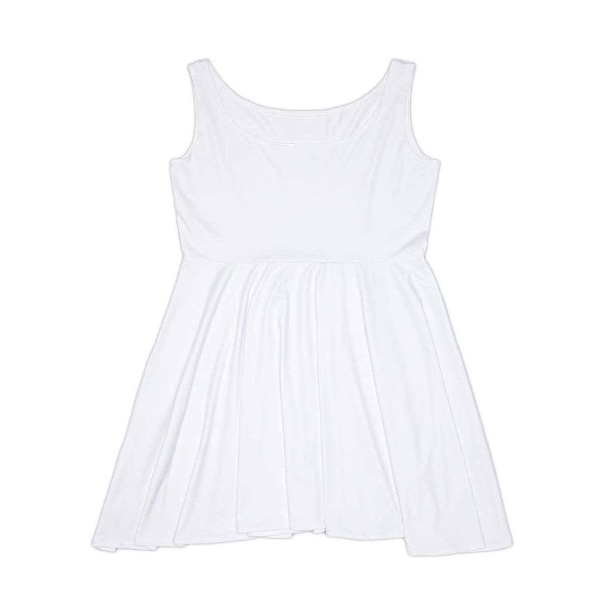
Custom All-Over Print Women's Skater Dress with Your Photo or Design
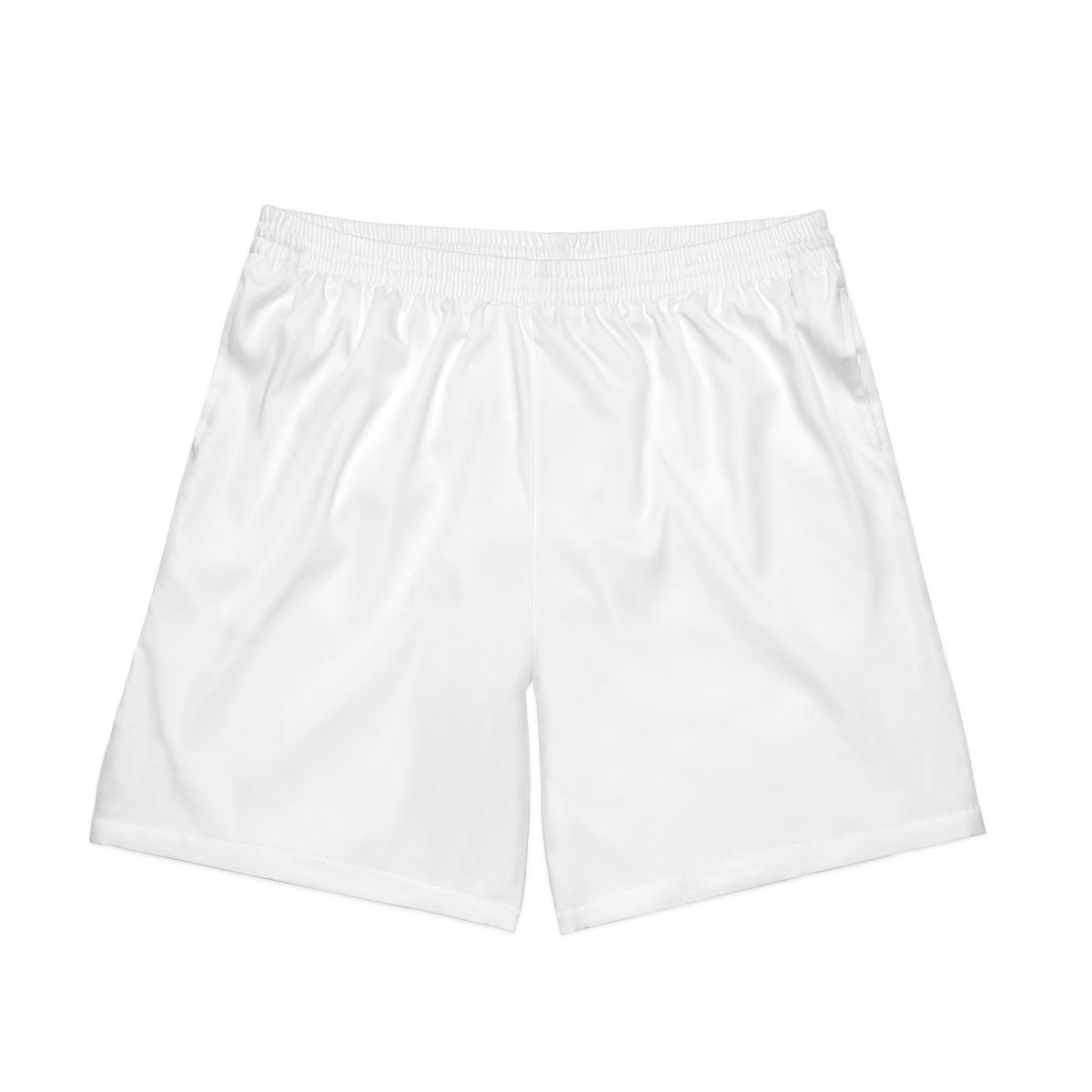
Custom All-Over Print Men's Swimwear Shorts with Your Photo or Design
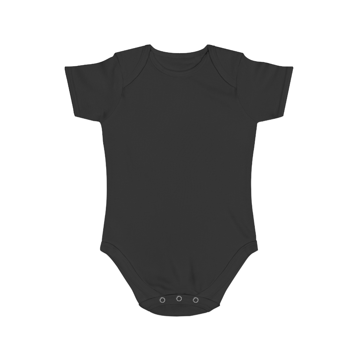
Custom All-Over Print Cotton Baby Onesie with Your Photo or Design
Custom Youth All-Over Print Leggings with Your Photo or Design
Related methods
How we know this
- Supplier all-over-print design guidelines — verified 2026-08-15
- BelDisegno production capability record — verified 2026-08-15