Printed on the surface
Direct-to-Garment (DTG) printing
Direct-to-garment (DTG) printing sprays water-based ink directly into the fibres of a finished garment, much like an inkjet printer prints onto paper. It reproduces full colour, photographs and fine detail faithfully, and the print stays soft to the touch because the ink sits in the fabric rather than on top of it. The one thing to design around is dark garments: those are printed with a layer of white ink underneath your artwork, so anything semi-transparent in your file will show that white layer through and look patchy.
- Colour range
- Full colourNo palette limit
- Photographs
- YesReproduce faithfully
- File formats
- PNG, JPG, SVGPNG preferred for transparency
- Resolution
- 300 DPIAt the printed size
- Colour mode
- RGBCMYK files are converted and can shift
- Background
- TransparentUnprinted areas show the garment
How it works
The garment is loaded flat onto a platen and a print head passes over it, spraying ink directly into the weave. Nothing is glued or pressed on, so there is no patch, no plastic hand-feel and no edge you can catch with a fingernail. Wash after wash the print softens with the shirt rather than cracking away from it.
On white and light garments the printer lays down only your colours. On dark garments it prints a white underbase first and then your colours on top — otherwise the ink would disappear into the fabric. That extra layer is invisible when your artwork is fully opaque, and very visible when it is not.
Gradients and transparency on dark garments
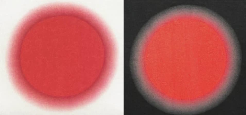
A gradient that fades to transparent is the one design that reliably disappoints on a dark DTG print. As your artwork gets more transparent, more of the white underbase shows through, so a fade that looks smooth on screen prints as a chalky, uneven patch.
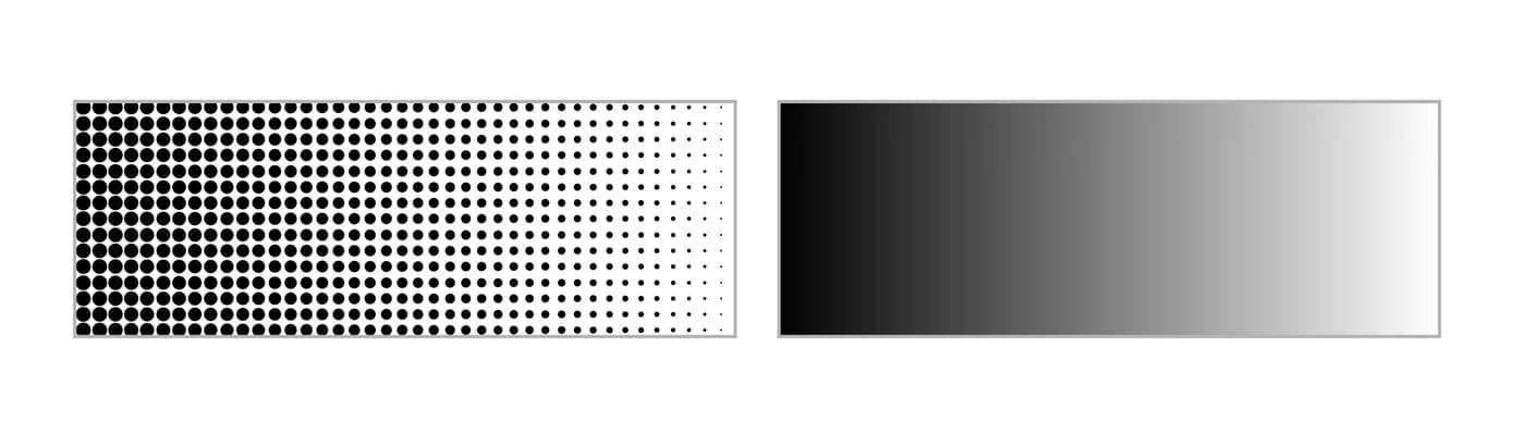
The fix is to build the fade out of small opaque dots instead — a halftone gradient. Every dot is fully opaque, so there is nothing for the underbase to show through, and at normal viewing distance the eye reads the changing dot density as a smooth fade. Most design software can produce this with a halftone or pattern effect. On white and light garments there is no underbase, so ordinary transparent gradients are fine.
Sizing across garment sizes
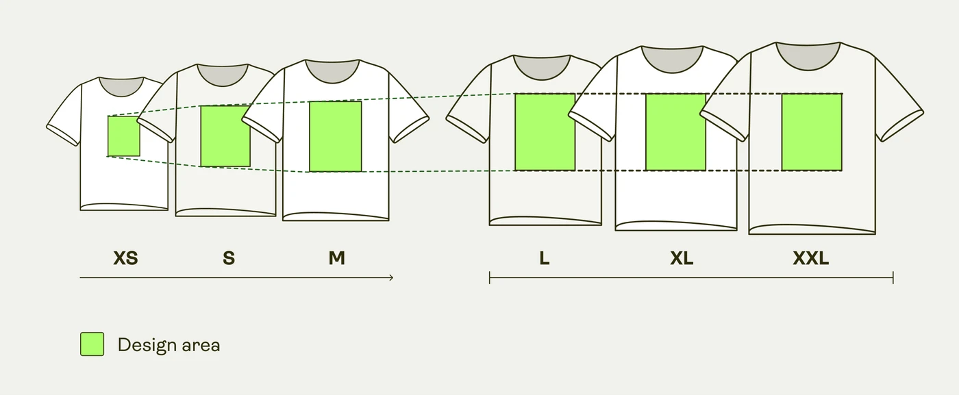
Artwork is placed once, against a large-size print area, and then scaled down proportionally for the smaller sizes so the design keeps the same relative footprint on every shirt. It is not scaled up for sizes above large — a print sized for a large is the same physical size on a 2XL, which is what keeps a chest print from creeping toward the shoulders.
Because everything is scaled from one placement, a design with detail that is already near the minimum legible size on a large will be smaller still on an extra-small. If your artwork contains fine text, check how it reads at the smallest size you plan to sell.
Do this, not that
Do
- Upload a PNG with a genuinely transparent backgroundWhatever is transparent is left unprinted and shows the garment colour.
- Work in RGB and export in RGBThe production system works in RGB; a CMYK file is converted on the way in and the colours can shift noticeably.
- Use a halftone gradient when you need a fade on a dark garmentOpaque dots give the eye a smooth fade with nothing for the white underbase to show through.
- Supply artwork at the print area’s own pixel sizeStretching a small file to fill a large print area does not create pixels — it spreads the ones you have.
Avoid
- Fading artwork to transparent on a dark garmentThe white underbase shows through the transparent areas and the fade prints patchy.
- Leaving a white rectangle behind the designWhite is an ink, not an absence — a white background prints as a visible white box.
- Hairline strokes and very small textInk spreads slightly into the weave, so the thinnest lines close up and small type fills in.
Common questions
- Can DTG printing reproduce gradients?
- Yes. On white and light garments a normal gradient, including one that fades to transparent, prints smoothly. On dark garments the printer lays a white underbase beneath your artwork, so transparent areas let that white show through and the fade looks patchy — use a halftone gradient made of small opaque dots instead, which prints cleanly on garments of any colour.
- Does a DTG print crack or peel?
- No. DTG ink is sprayed into the fibres of the garment rather than pressed on as a separate layer, so there is nothing that can lift or crack away. The print softens with the garment over time instead of flaking off it.
- What resolution should a DTG print file be?
- Match the print area’s own pixel size. Every side we print states its print area in pixels, and that is the number to build to — a 1,200 px file stretched across a 4,200 px print area has only a third of the pixels it needs, however sharp it looks on screen. Judge the file against the print area it is going onto, not against its own dimensions.
- Should DTG files be RGB or CMYK?
- RGB. The production system works in RGB throughout, and a CMYK file is converted on the way in — a conversion that can shift colours significantly. If you want to preview how the print will look, convert a copy to CMYK to check it, then undo and export the original in RGB.
- Will my design be the same size on every shirt size?
- No. The design is scaled down proportionally on sizes smaller than large so it keeps the same relative footprint on the garment, and it is not scaled up on sizes above large. That keeps a chest print looking like a chest print on an extra-small and stops it drifting toward the shoulders on a 2XL.
Products made this way
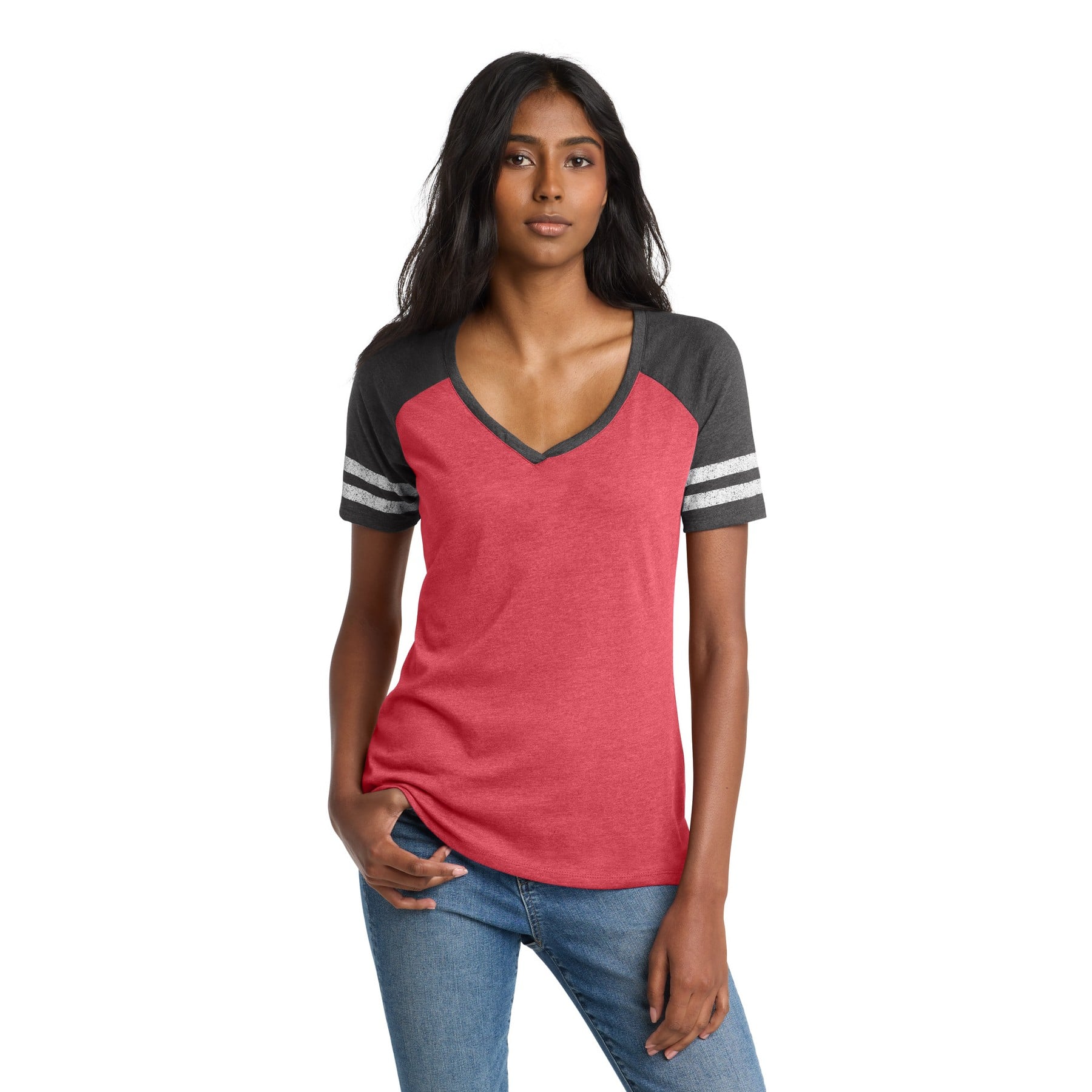
Custom Volleyball T-Shirt, Two-Tone Women's Cut, with Your Logo
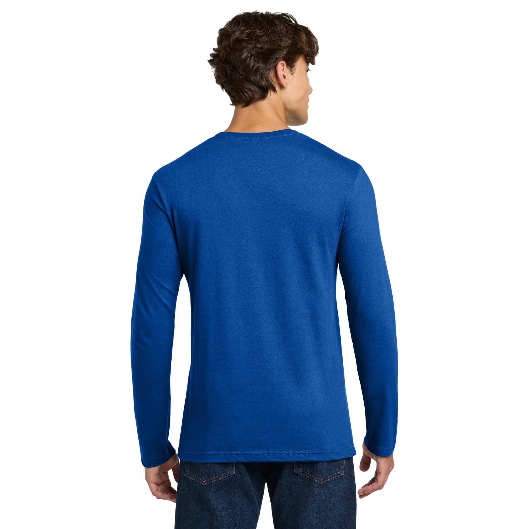
Custom Christmas Long Sleeve Shirt with Your Photo
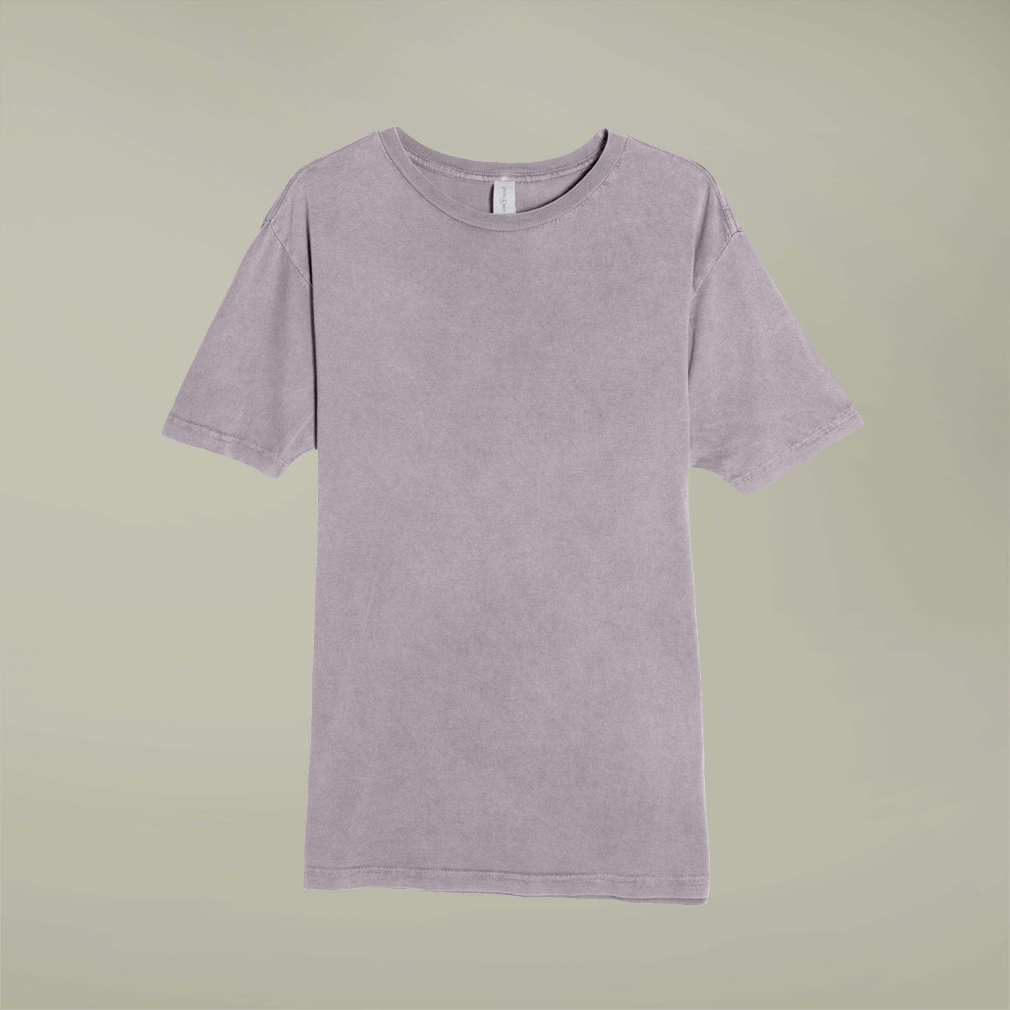
Custom Vintage T-Shirt, Mineral Washed, with Your Design
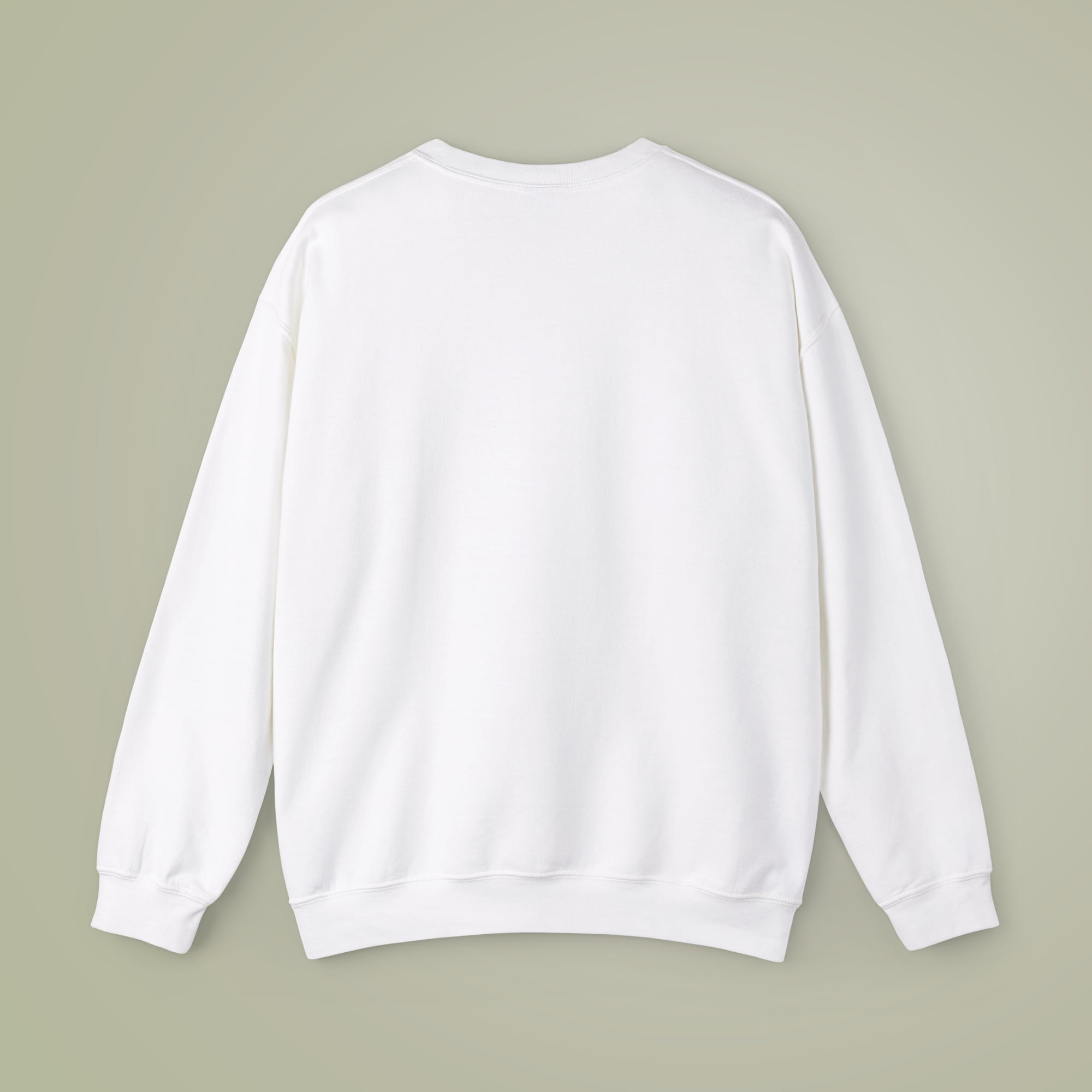
Custom Crewneck Sweatshirt in Sand with Your Photo
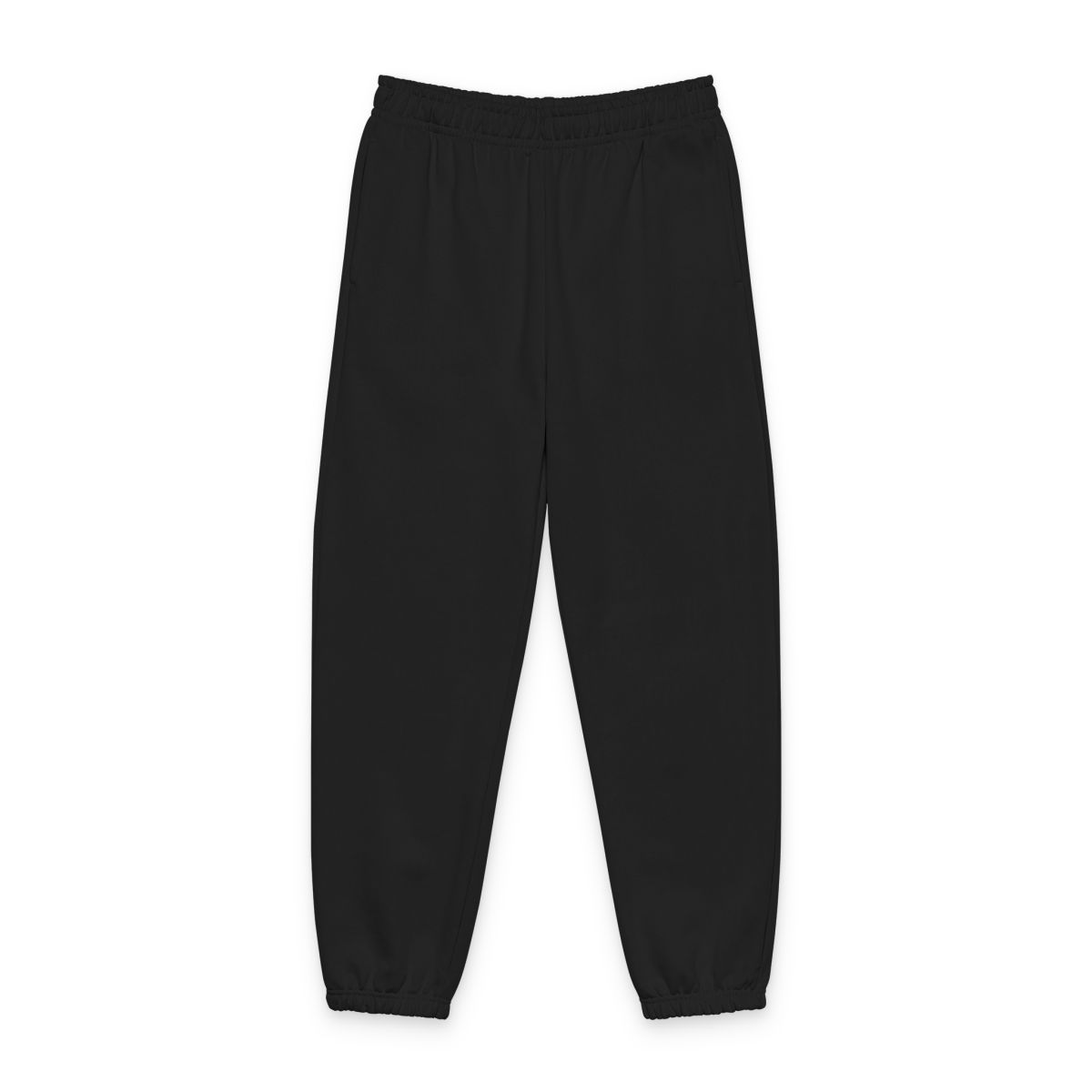
Custom Thick Sweatpants, Right Leg Print, with Your Design
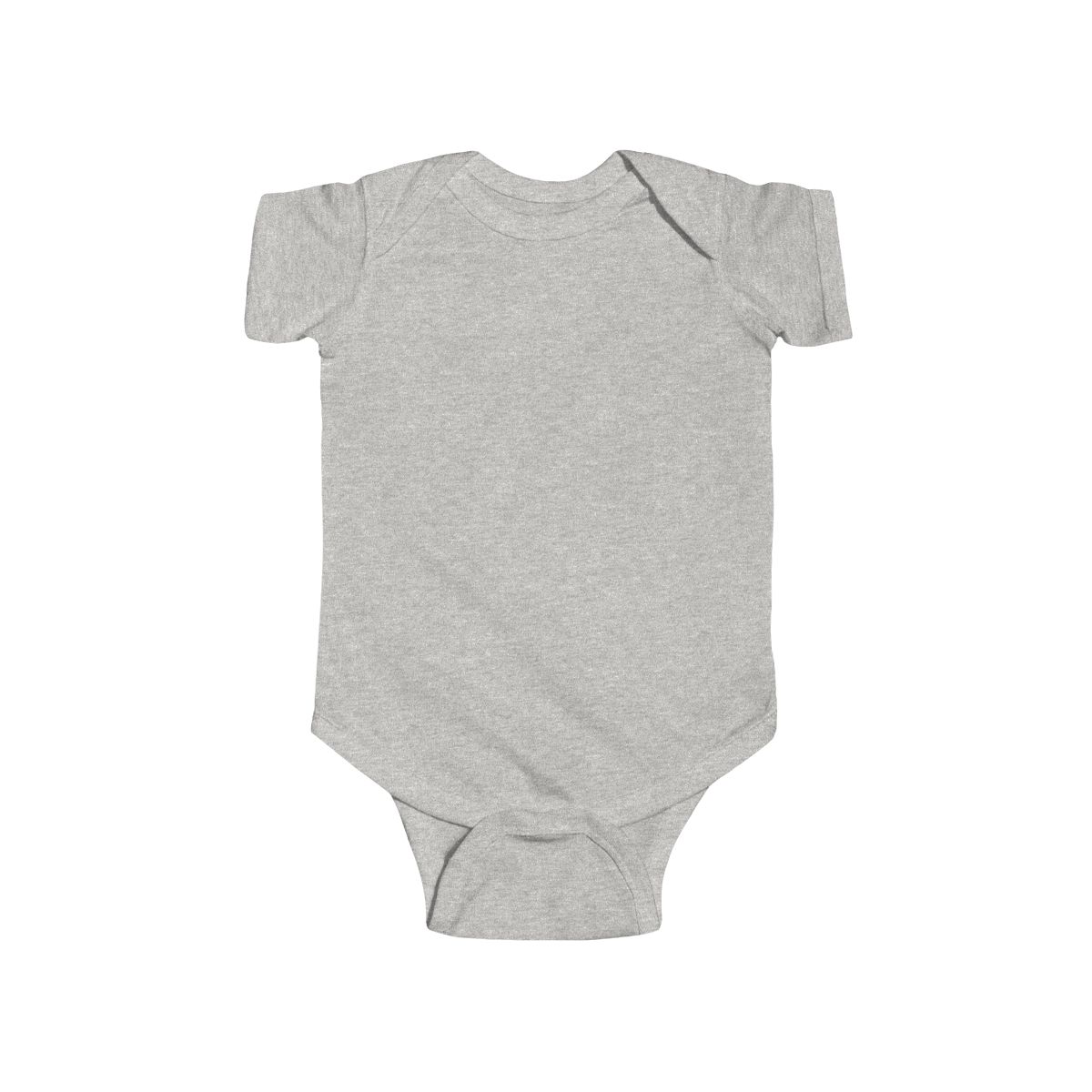
Custom Baby Onesie for Newborns with Your Photo
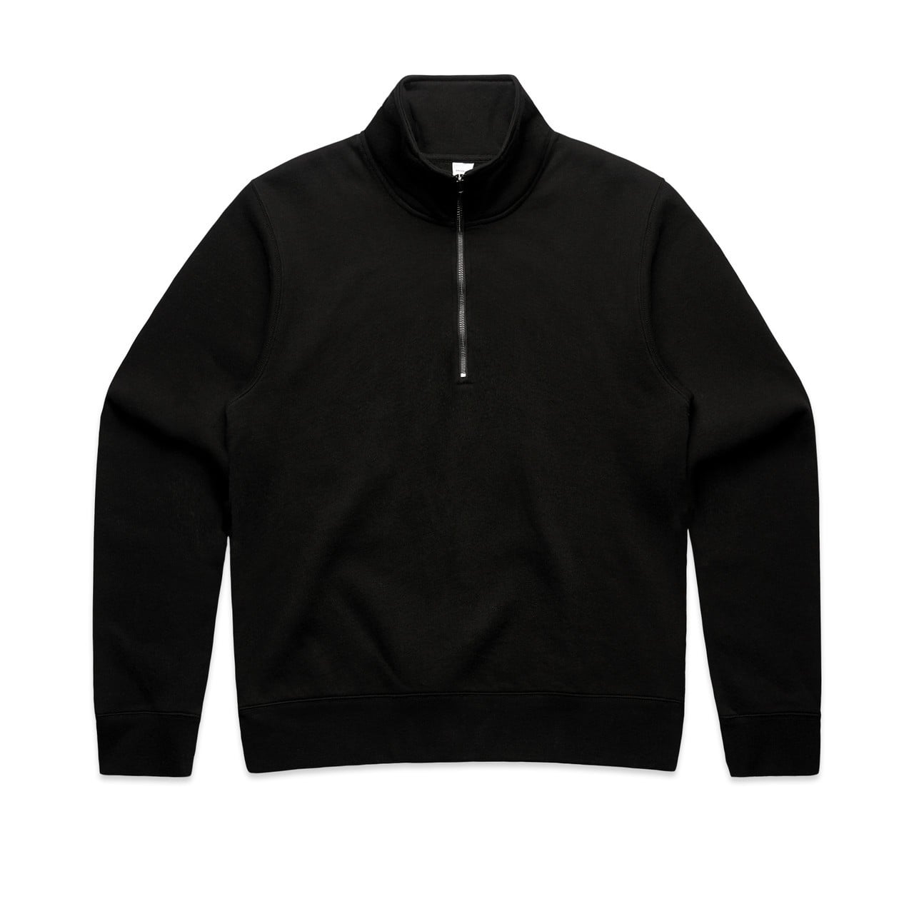
Custom Women's Half-Zip, Crew Neck, with Your Design
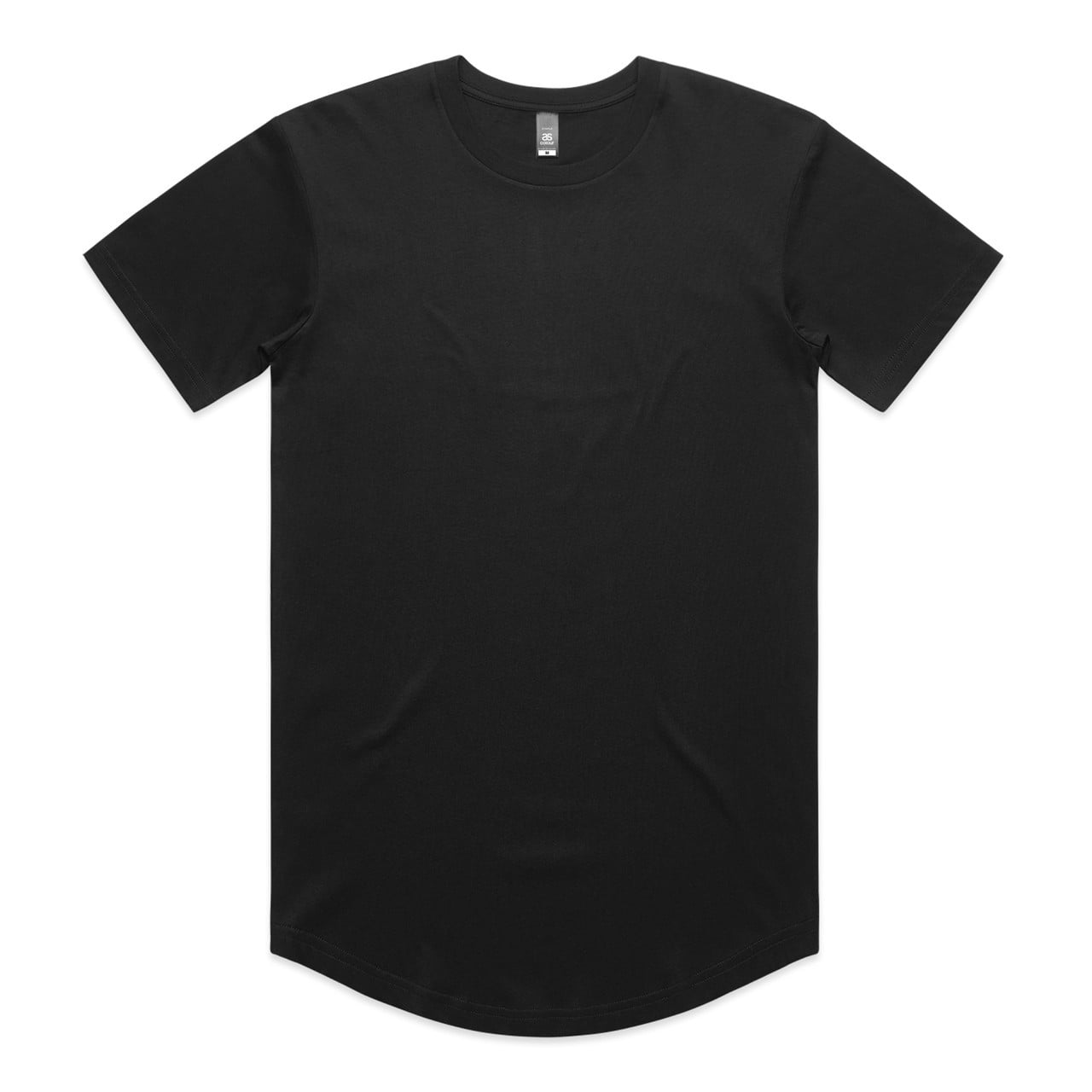
Custom Curve T-Shirt in Navy, Black or White with Your Text
Related methods
How we know this
- Supplier DTG and print-file design guidelines — verified 2026-08-15
- BelDisegno production capability record — verified 2026-08-15