Printed on the surface
Digital printing
Digital printing lays ink directly onto a flat surface — paper, card, vinyl, magnet stock — in a single pass, the same way a high-end office printer works but with pigment inks and far better registration. It is the most faithful method we offer: full colour, photographs, real transparency and genuinely fine detail all reproduce, and the printed sheet is what you designed. The design work is mostly about the edges, because most of these products are cut after printing and the cut has a tolerance.
- Colour range
- Full colour
- Photographs
- YesThe most faithful of any method
- Soft transparency
- SupportedReal gradients to transparent
- File formats
- PNG, JPG, SVG
- Resolution
- 300 DPIAt the printed size
- Colour mode
- RGBCMYK files are converted and can shift
Bleed, print area and safe area
Three boundaries matter on anything that gets trimmed. The bleed is the outermost band — artwork should run into it, but nothing important should sit there, because it is the part the blade may remove. The print area is everything that gets ink. The safe area is the inner region where you can be certain a trim will not reach; all text and any element you would notice losing belongs inside it.
The reliable habit is to extend backgrounds and patterns fully into the bleed and keep content inside the safe area. Doing both means a trim that lands anywhere in its tolerance still produces a clean edge with nothing cut off and no unprinted white sliver.
Stickers and cut lines
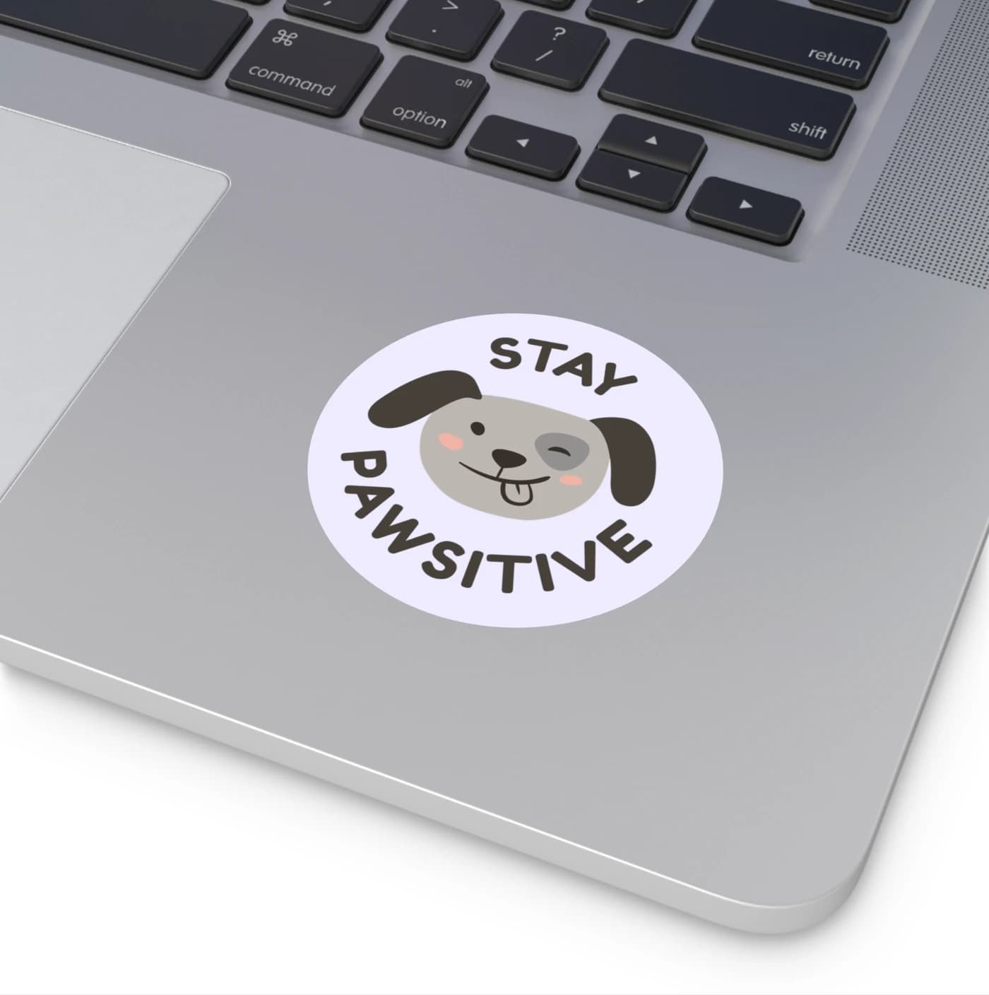
On square and round stickers, the size shown includes the backing paper, so cover the whole printable area with artwork unless you specifically want a white border. Anything left unprinted reads as a deliberate white margin in the finished sticker.
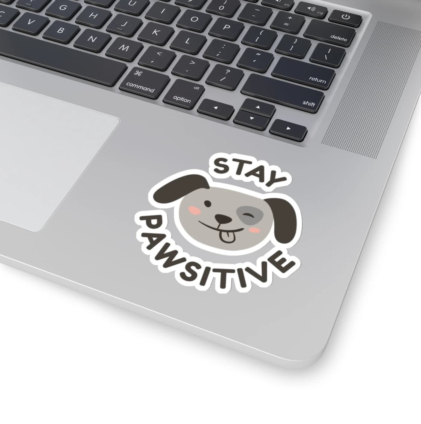
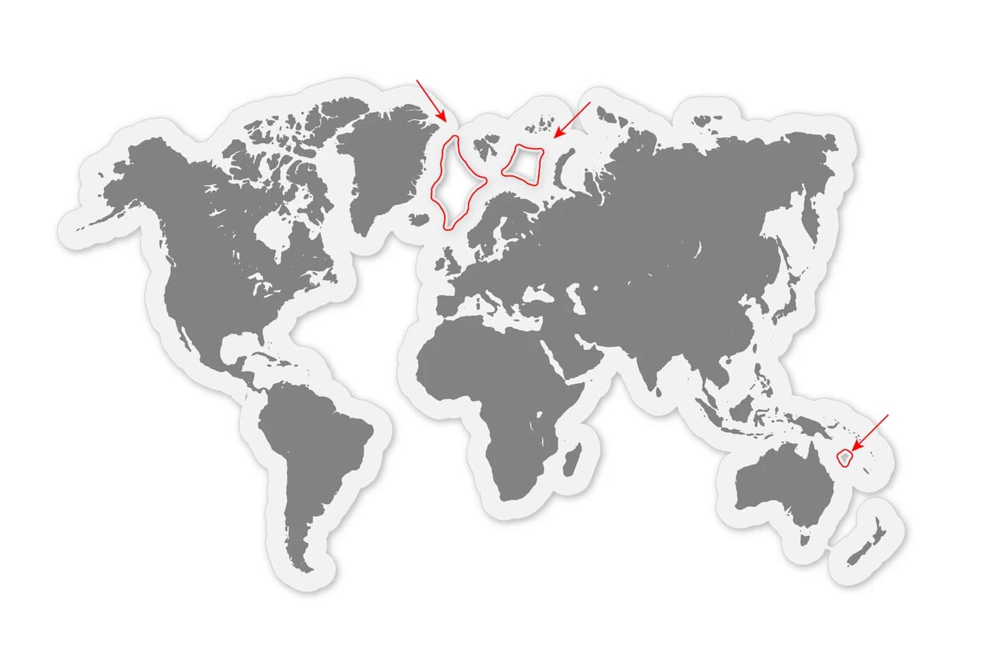
Kiss-cut stickers are cut through the vinyl but not the backing, following the shape of your artwork. Upload a PNG with a genuinely transparent background and no stray specks — a single stray pixel becomes its own tiny sticker. Elements that do not touch are cut as separate stickers, so if a design is meant to come away as one piece, make sure its parts actually connect.
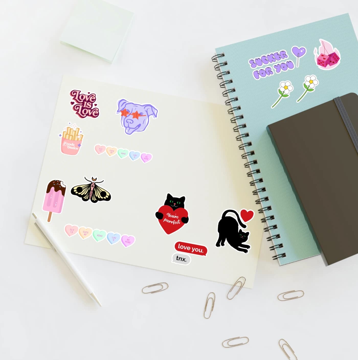
When you deliberately want several stickers on one sheet, leave enough space between them for the blade: roughly 65 px on a 600 px sticker, 110 px at 900 px, 150 px at 1,200 px and 200 px at 1,800 px, and about 75 px on sticker sheets. Tighter than that and the cutter cannot reliably separate them.
Colour and detail
This method holds detail better than any other we offer, so fine line work, small type and subtle tonal shifts are all fair game. Real transparency works too — a gradient that fades to nothing fades to nothing, with no underbase to show through.
Design in RGB and export in RGB. If you want to see roughly how the print will sit, convert a copy to CMYK to preview the shift, then undo and export the RGB original — printing from a converted CMYK file gives you the shift twice.
Do this, not that
Do
- Run backgrounds and patterns all the way into the bleedA trim that lands at the edge of tolerance then still has ink to cut through instead of leaving a white sliver.
- Keep text and key elements inside the safe areaThat is the region the blade cannot reach at any point in its tolerance.
- Check kiss-cut files for stray specks before uploadingAny isolated mark in the file is treated as its own shape and cut as a separate sticker.
- Connect elements that should come away as one stickerShapes that do not touch are cut apart, whether or not that was the intention.
Avoid
- Placing text right against the trim lineTrimming has a tolerance; type on the line will be shaved on some copies and not others.
- Tight negative gaps between cut shapesThe cutter cannot follow a gap narrower than its own accuracy, so the shapes merge.
Common questions
- What is bleed, and how much do I need?
- Bleed is the band of artwork that extends past the final trim line so that a cut landing anywhere within its tolerance still has ink to cut through. Extend backgrounds and patterns fully into the bleed area shown in the template, and keep anything important inside the safe area — the inner region marked by a dashed line.
- How much space should I leave between kiss-cut stickers?
- Around 65 px on a 600 px sticker, 110 px at 900 px, 150 px at 1,200 px, 200 px at 1,800 px, and roughly 75 px on sticker sheets. Less than that and the cutter cannot reliably separate the shapes.
- Can digitally printed artwork use transparent gradients?
- Yes. Unlike garment printing, digital printing supports genuine soft transparency, so a gradient that fades to nothing prints as a fade to the bare surface with no white underbase showing through.
- Why did my sticker come out with a white border?
- The size shown for a square or round sticker includes its backing paper, so any part of that area you leave unprinted becomes a visible white margin. Cover the entire printable area with artwork unless the white border is intentional.
Products made this way
Custom Uncoined Napkins in White or Ecru with Your Names
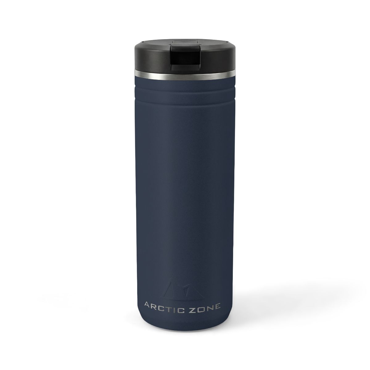
Custom Thermal Photo Tumbler with Straw and Your Photo
Custom Board Book, a Baby Photo Book with Your Photo
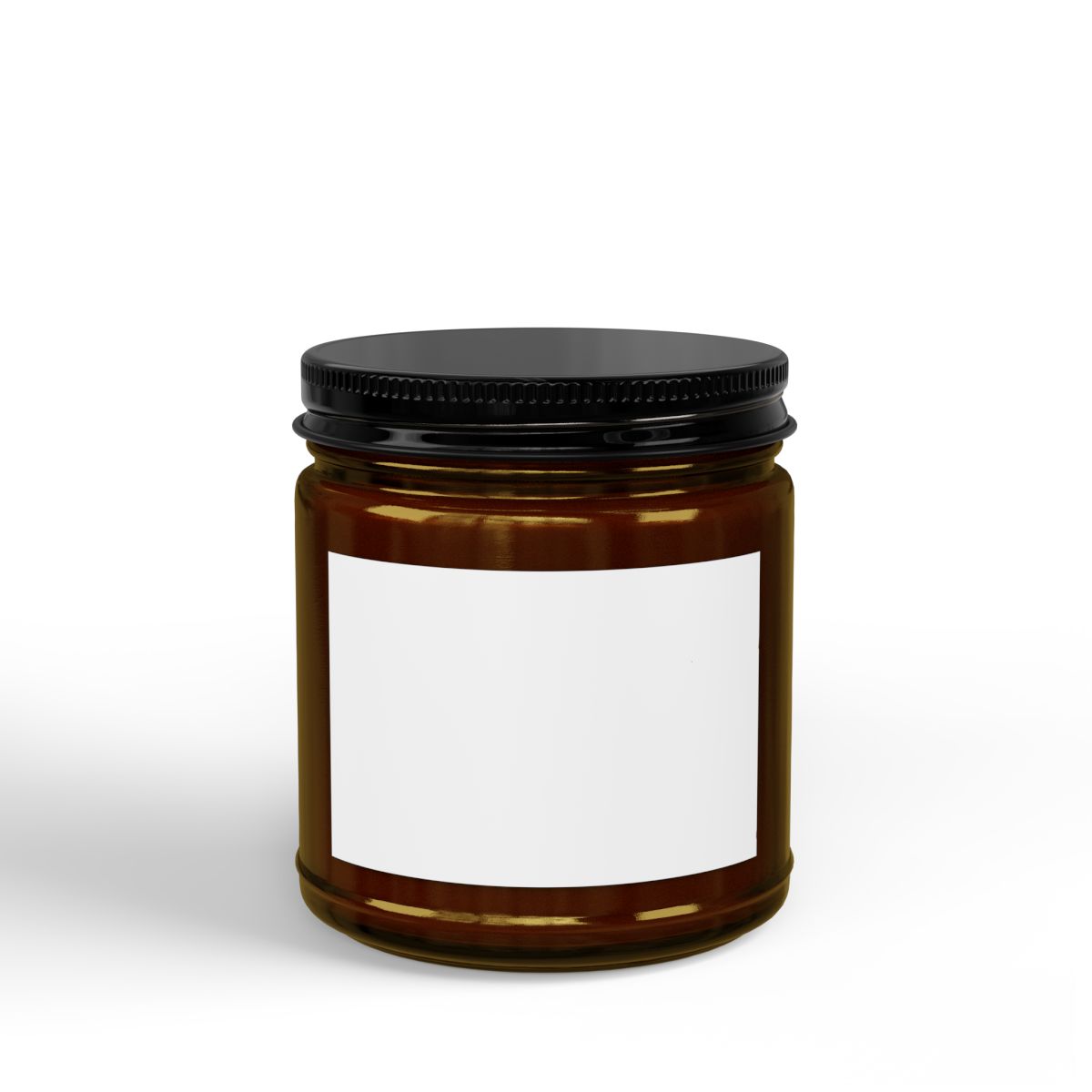
Custom Candles, Black Lid Soy Candle in 4oz or 9oz with Your Photo
Custom Candles, Clear or Frosted Glass Candle with Your Photo
Custom Photo Candle, Frosted Glass with Your Picture
Custom Framed Poster in Black, White or Brown with Your Photo

Photo Sticker, Custom Die-Cut to Shape with Your Photo
Related methods
How we know this
- Supplier sticker and print-file design guidelines — verified 2026-08-15
- BelDisegno production capability record — verified 2026-08-15